Design Systems at Scale: Building a UI Foundation Your Team Will Actually Use
Learn how to build a production-grade design system that scales across teams. Covers design tokens, component APIs, Storybook documentation, versioning with changesets, and adoption strategies used by senior frontend engineers.
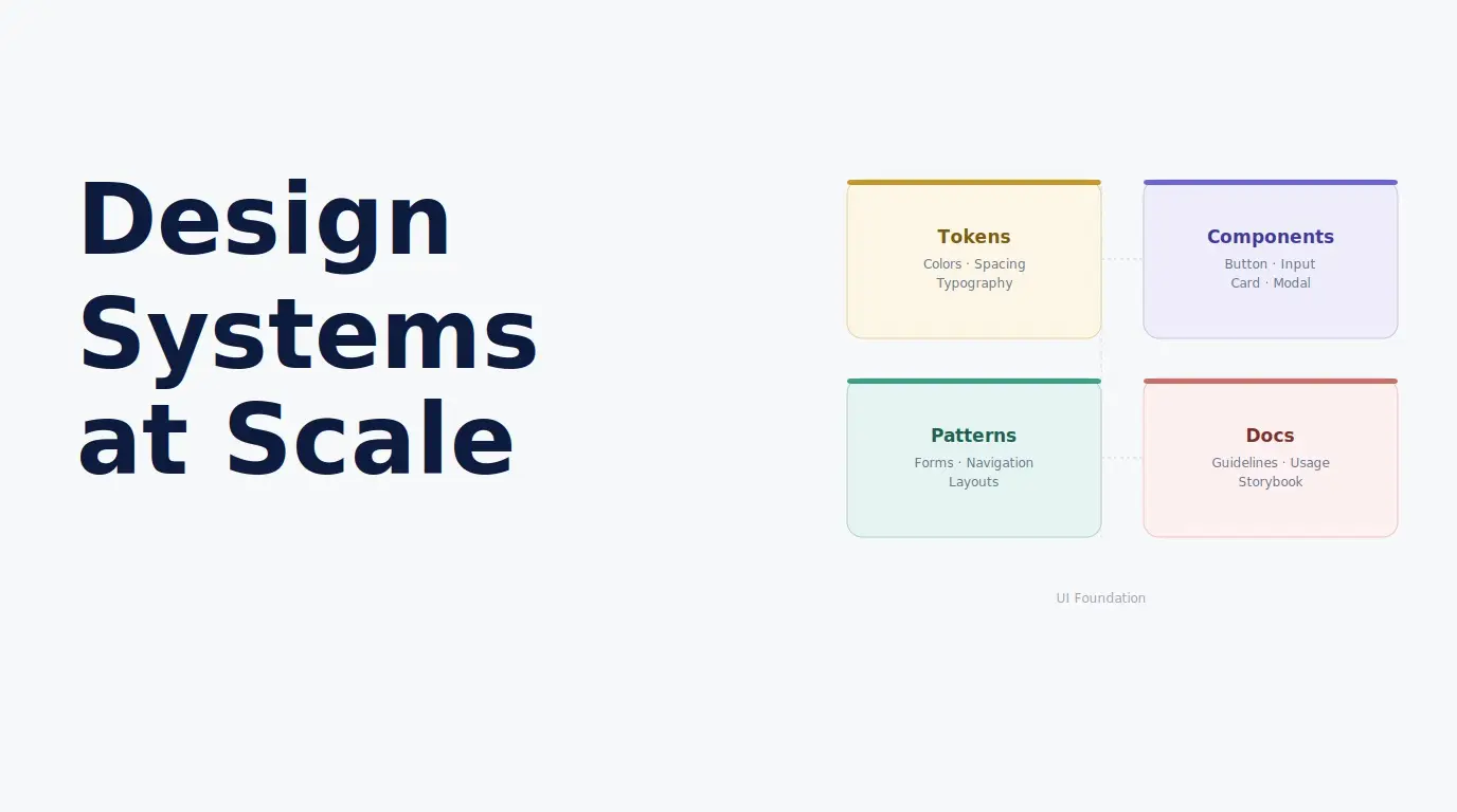
Introduction#
Most design systems fail not because they are poorly designed, but because they are poorly adopted. A component library that engineers work around rather than with is not a foundation. It is an obstacle. The difference between a design system that thrives and one that gets abandoned comes down to a small set of decisions made early: how tokens are structured, how component APIs are designed, how documentation is written, and how the system is maintained over time.
This guide is not about what a design system should contain. It is about how to build one that your engineering and design teams will actually use, contribute to, and trust as the source of truth for your product’s UI.
1. What a Design System Actually Is#
A design system is not a component library. A component library is one artifact of a design system. The system itself is the combination of decisions, documentation, tooling, and processes that allow a team to build consistent, high-quality UI at speed.
The three layers of a mature design system are:
Foundation: Design tokens, typography scale, spacing system, color palette, motion principles, and accessibility standards. This layer answers the question: what are the visual and behavioral rules of our product?
Component library: Reusable, documented, accessible UI components built on top of the foundation. This layer answers the question: what are the building blocks we assemble features from?
Patterns and guidelines: Documented best practices for combining components to solve common UI problems. This layer answers the question: how do we build this type of feature consistently?
Teams that skip the foundation layer and go straight to building components end up with a library of components that are visually inconsistent, difficult to theme, and increasingly divergent over time.
2. Token Architecture: The Foundation Layer#
Design tokens are named values that represent the visual decisions of a product: colors, typography, spacing, borders, shadows, and motion. They are the single source of truth that both design tools and code reference. When tokens are structured correctly, changing a brand color requires updating one value in one place, and the change propagates automatically to every component that references that token.
Three-Tier Token Hierarchy#
The most robust token architecture uses three tiers that build on each other.
Tier 1: Primitive Tokens#
Raw values with no semantic meaning. These are the complete palette of available values.
/* tokens/primitives.css */
:root {
  /* Color palette */
  --color-blue-100: #dbeafe;
  --color-blue-500: #3b82f6;
  --color-blue-700: #1d4ed8;
  --color-blue-900: #1e3a5f;

  --color-slate-50:  #f8fafc;
  --color-slate-200: #e2e8f0;
  --color-slate-700: #334155;
  --color-slate-900: #0f172a;

  --color-red-500:   #ef4444;
  --color-green-500: #22c55e;

  /* Spacing scale */
  --space-1:  0.25rem;
  --space-2:  0.5rem;
  --space-4:  1rem;
  --space-6:  1.5rem;
  --space-8:  2rem;
  --space-12: 3rem;
  --space-16: 4rem;

  /* Border radius */
  --radius-sm: 0.25rem;
  --radius-md: 0.5rem;
  --radius-lg: 0.75rem;
  --radius-xl: 1rem;
  --radius-full: 9999px;

  /* Typography */
  --font-size-xs:   0.75rem;
  --font-size-sm:   0.875rem;
  --font-size-base: 1rem;
  --font-size-lg:   1.125rem;
  --font-size-xl:   1.25rem;
  --font-size-2xl:  1.5rem;
  --font-size-4xl:  2.25rem;

  --font-weight-normal:   400;
  --font-weight-medium:   500;
  --font-weight-semibold: 600;
  --font-weight-bold:     700;

  --line-height-tight:  1.25;
  --line-height-normal: 1.5;
  --line-height-relaxed: 1.75;
}
Tier 2: Semantic Tokens#
Values named by their purpose rather than their appearance. Semantic tokens reference primitives and add meaning.
/* tokens/semantic.css */
:root {
  /* Text */
  --color-text-primary:   var(--color-slate-900);
  --color-text-secondary: var(--color-slate-700);
  --color-text-disabled:  var(--color-slate-400);
  --color-text-inverse:   var(--color-white);

  /* Backgrounds */
  --color-bg-default:  var(--color-slate-50);
  --color-bg-surface:  var(--color-white);
  --color-bg-subtle:   var(--color-slate-100);
  --color-bg-overlay:  rgba(15, 23, 42, 0.5);

  /* Interactive */
  --color-interactive:         var(--color-blue-500);
  --color-interactive-hover:   var(--color-blue-700);
  --color-interactive-subtle:  var(--color-blue-100);

  /* Feedback */
  --color-feedback-error:   var(--color-red-500);
  --color-feedback-success: var(--color-green-500);

  /* Border */
  --color-border-default: var(--color-slate-200);
  --color-border-focus:   var(--color-blue-500);

  /* Spacing semantic aliases */
  --space-component-padding-sm: var(--space-2);
  --space-component-padding-md: var(--space-4);
  --space-component-padding-lg: var(--space-6);
  --space-section-gap:          var(--space-12);
}
Tier 3: Component Tokens#
Values scoped to a specific component. These allow per-component customization without breaking the overall system.
/* tokens/button.css */
:root {
  --button-bg:              var(--color-interactive);
  --button-bg-hover:        var(--color-interactive-hover);
  --button-text:            var(--color-text-inverse);
  --button-border-radius:   var(--radius-md);
  --button-padding-x-md:    var(--space-4);
  --button-padding-y-md:    var(--space-2);
  --button-font-weight:     var(--font-weight-semibold);
  --button-font-size:       var(--font-size-sm);
}
Dark Mode Through Token Overrides#
Because semantic tokens reference primitives, dark mode requires changing only the semantic layer. Component code never changes.
/* tokens/dark.css */
[data-theme="dark"] {
  --color-text-primary:   var(--color-slate-50);
  --color-text-secondary: var(--color-slate-300);
  --color-bg-default:     var(--color-slate-900);
  --color-bg-surface:     var(--color-slate-800);
  --color-border-default: var(--color-slate-700);
}
3. Component API Design Principles#
The API of a component (its props interface) is its most important design decision. A poorly designed API creates friction that pushes engineers to build their own solutions rather than use the shared component. A well-designed API makes the right thing easy and the wrong thing hard.
Principle 1: Predictable Naming Conventions#
Consistent prop naming across all components reduces cognitive load. Establish and document conventions before building the first component.
// Naming conventions:
// - Boolean props: use "is" or "has" prefix (isDisabled, isLoading, hasError)
// - Event handlers: use "on" prefix (onClick, onChange, onDismiss)
// - Size variants: "sm" | "md" | "lg" (never "small" | "medium" | "large")
// - Visual variants: "variant" prop (primary | secondary | ghost | destructive)

type ButtonProps = {
  variant:    "primary" | "secondary" | "ghost" | "destructive";
  size:       "sm" | "md" | "lg";
  isLoading?: boolean;
  isDisabled?: boolean;
  onClick?:   (event: React.MouseEvent) => void;
  children:   React.ReactNode;
};
Principle 2: Sensible Defaults#
Every prop that has a reasonable default should have one. Engineers should be able to render a component with no props and get something usable.
function Button({
  variant  = "primary",
  size     = "md",
  isLoading  = false,
  isDisabled = false,
  type     = "button",
  ...props
}: ButtonProps) {
  return (
    <button
      type={type}
      disabled={isDisabled || isLoading}
      aria-busy={isLoading}
      {...props}
    />
  );
}
Principle 3: Polymorphism with asChild#
The asChild pattern allows a component to delegate its rendering to a child element. This is the cleanest solution to the problem of wanting a Button’s styles on an anchor tag, or a Heading’s styles on a div.
import { Slot } from "@radix-ui/react-slot";

function Button({ asChild, children, className, ...props }: ButtonProps) {
  const Comp = asChild ? Slot : "button";
  return (
    <Comp className={cn(buttonVariants(), className)} {...props}>
      {children}
    </Comp>
  );
}

// Usage: renders as <a> with button styles
<Button asChild>
  <a href="/dashboard">Go to Dashboard</a>
</Button>
4. Documentation That Engineers Actually Read#
The most common reason engineers do not use a design system is not that the components are wrong. It is that they cannot find what they need quickly, or the documentation does not answer the questions they actually have.
What Every Component Page Needs#
Usage example first: Show the most common use case in the first ten lines. Engineers scan for working code before they read prose.
Props table: Every prop documented with its type, default value, and a one-sentence description.
All variants rendered: Every valid combination of size and variant visible without running code.
Do and do not examples: Side-by-side examples of correct and incorrect usage for the patterns that are most commonly misused.
Accessibility notes: What ARIA attributes are applied automatically, what the component’s keyboard behavior is, and what the consuming engineer is responsible for.
Copy-paste ready code: Every example should be directly usable without modification.
Storybook as Living Documentation#
Storybook stories serve dual purpose: they are the development environment where components are built and tested, and they are the documentation that engineers reference when consuming the component. When stories are written thoroughly, the documentation updates itself automatically as the component changes.
// Button.stories.tsx
import type { Meta, StoryObj } from "@storybook/react";
import { Button } from "./Button";

const meta: Meta<typeof Button> = {
  title:     "Primitives/Button",
  component: Button,
  parameters: {
    docs: {
      description: {
        component: "The primary action element. Use for form submissions, confirmations, and navigation triggers.",
      },
    },
  },
};

export default meta;
type Story = StoryObj<typeof Button>;

export const AllVariants: Story = {
  render: () => (
    <div style={{ display: "flex", gap: "1rem", flexWrap: "wrap", alignItems: "center" }}>
      <Button variant="primary">Primary</Button>
      <Button variant="secondary">Secondary</Button>
      <Button variant="ghost">Ghost</Button>
      <Button variant="destructive">Destructive</Button>
    </div>
  ),
};

export const AllSizes: Story = {
  render: () => (
    <div style={{ display: "flex", gap: "1rem", alignItems: "center" }}>
      <Button size="sm">Small</Button>
      <Button size="md">Medium</Button>
      <Button size="lg">Large</Button>
    </div>
  ),
};

export const States: Story = {
  render: () => (
    <div style={{ display: "flex", gap: "1rem" }}>
      <Button>Default</Button>
      <Button isLoading>Loading</Button>
      <Button isDisabled>Disabled</Button>
    </div>
  ),
};
5. Versioning and Release Management#
A design system without a clear versioning strategy creates a different problem than no design system at all. Teams cannot upgrade safely, breaking changes are not communicated clearly, and consumers get stuck on old versions because upgrading is too risky.
Semantic Versioning Strictly Applied#
Patch (1.0.x): Bug fixes that do not change the public API. Safe to apply automatically.
Minor (1.x.0): New components, new props, new variants. Backward compatible. No changes needed in consuming code.
Major (x.0.0): Breaking changes: renamed props, removed components, changed behavior. Requires consuming teams to update their usage.
Changesets for Automated Release Management#
# Add a changeset when you make a change
npx changeset add

# The CLI will prompt:
# - Which packages changed
# - What type of change (patch / minor / major)
# - A description that becomes the changelog entry

# In CI: bump versions and publish automatically
npx changeset version   # Updates package.json and CHANGELOG.md
npx changeset publish   # Publishes to NPM registry
Migration Guides for Major Versions#
Every major version release must include a migration guide. The guide should list every breaking change, show the before and after code for each, and ideally include a codemod that automates the migration for common patterns.
6. Driving Adoption Across Teams#
Technical quality is a necessary but insufficient condition for design system adoption. Engineers adopt tools that make their work easier, that are reliable, and that are actively maintained. Building that trust is as much a product and communication challenge as a technical one.
The Office Hours Model#
Design system teams that run regular office hours, a standing meeting where any engineer can bring questions, problems, or feature requests, consistently see higher adoption than teams that communicate only through documentation and pull request reviews. The direct channel lowers the barrier to engagement and surfaces real usage friction before it becomes a reason to abandon the system.
Contribution Guidelines#
A design system that only the platform team can contribute to will always lag behind the needs of product teams. A clear, documented contribution process allows product engineers to add components and patterns back to the system rather than maintaining them locally.
The contribution guide should cover: how to propose a new component, the review criteria, the testing requirements, the documentation requirements, and how the changeset and release process works.
Usage Analytics#
Tracking which components are used in production, and which are not, reveals what to invest in and what to deprecate. Tools like Chromatic’s component usage tracking or custom AST analysis of the codebase provide this data automatically.
Conclusion#
A design system is a product built for an internal audience. Like any product, it succeeds or fails based on whether it solves real problems for the people it is built for. The technical foundations covered in this guide, token architecture, component API design, thorough documentation, and principled versioning, create the conditions for success. But adoption comes from consistent investment in the human side: listening to feedback, reducing friction, communicating changes clearly, and making it easier to use the system than to work around it.
The goal is not a perfect component library. The goal is a shared foundation that makes every team in the organization faster, and every user of the product more likely to encounter a consistent, polished, and accessible interface.
Build the system. Tend to it. Earn the trust of the teams that depend on it.